Inside Airbnb's brand evolution
It is a big week for the design team at Airbnb. In fact, it’s a big week for everyone in the Airbnb community, as we believe the evolution of our brand helps the world truly understand what we stand for. Wednesday we announced our new brand to a group of our top hosts and guests, which includes many in the design community. But we also wanted to give you an inside look at how this new direction came to be.
The Airbnb marque has evolved in our relatively short history. The original cyan and magenta Air Bed & Breakfast logo captured the youth of a startup founded by two designers with extra space in their San Francisco apartment. Airbnb’s former marques were designed by co-founder Joe Gebbia years ago, each created in a relatively short period of time. When you’re doing everything you can to make a company sustainable, the marque is not always priority number one. But Joe and Brian (Chesky) always intended to give the visual brand the attention it deserved.
Our company logo has evolved in our first six years.
Fast forward to this time last year when we experienced a moment of insight. While we have a large and passionate community around the world, our brand did not quite communicate all that we stand for. Airbnb hosts and travelers around the world shared stories of incredibly meaningful experiences and we started to understand the potential of this community–to build a world where people could feel a sense of belonging anywhere. We knew we had an opportunity to do things right and create a representation of this vision that would endure.
Immersion
Just as we brought in a professional architecture team to partner closely with us on the design of our new headquarters in San Francisco, we sought to find the best creative team to work alongside us throughout the process of building our new brand.

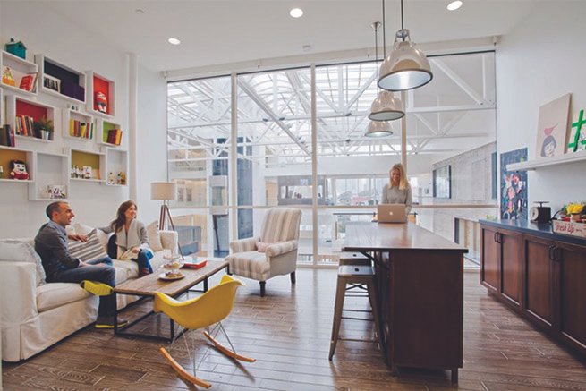
Our team, including the company founders, worked closely with an architecture firm to design our San Francisco headquarters.
We started with a list of a few dozen agencies, both large and small, edgy and traditional, local and global, in our search. We asked a smaller subset to share their work and blue sky ideas about Airbnb, which led us to find a partner in DesignStudio. DesignStudio showed such passion for our brand early in the process that they outfitted part of their London studio as an Airbnb listing. When we arrived for an early morning presentation, the DesignStudio team greeted us with fresh orange juice and coffee. They were true hosts, and it made us swoon.
The DesignStudio team replicated an Airbnb listing space in their office during the pitch process, complete with all the right details.
Our collaboration with DesignStudio was experimental and immersive. We challenged the DesignStudio team to open their creative process and engage us in their work. We wanted them to experience what Airbnb was all about firsthand, not only by working out of our San Francisco office, but by traveling internationally on Airbnb, staying with our hosts and guests, and connecting with our teams around the world, all before starting creative work.
It was the first time the agency had done anything quite like this. “Working with Airbnb was different. We worked closely throughout the process, building a relationship that transcends the normal client/agency model, as we became part of Airbnb,” DesignStudio Founding Partner Paul Stafford explains.
We kicked off the immersion process over breakfast at our headquarters. A small team from DesignStudio conducted extensive interviews and workshops with our Marketing, Experience Design, Insights, and Graphic Design teams in our San Francisco office.


The Airbnb Design and DesignStudio teams bonded while pouring over hundreds of pieces of inspiration and building mood boards together.
They came prepared with boards of inspiration that touched upon many elements of a brand such as messaging, color, typography, and photography. We discussed how we think of Airbnb compared to other brands and where we imagine our brand in the future. Our teams bonded and aligned through these workshops, and together we set a vision for the future of our brand.
Furthermore, four members of the DesignStudio team traveled the globe. They stayed in 18 Airbnb homes in 13 cities around the world. We organized Host meetups to provide a deeper sense of connection with our community. We wanted them to have an authentic understanding of how people think about the Airbnb brand. The result of their immersion process is a beautifully illustrated book that curates what they heard from our team.


DesignStudio captured Airbnb’s brand, in our own words, in an illustrated book titled “Open”.
Creative
DesignStudio dove into creative explorations, developing initial concepts out of their London studio. The team returned to San Francisco with loose sketches, mood boards, and inspiration. They also presented a concept for our color palette, drawing inspiration from all over the world: textiles, design, art and architecture. They refined a few key directions and continued to work closely with our team in San Francisco.

Our Co-founders, Joe Gebbia and Brian Chesky, take in inspiration and initial sketches.

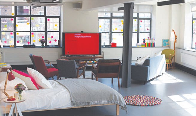
DesignStudio’s setup in our headquarters.

Close collaboration was essential to the process. DesignStudio opened the door to their process and worked out of the Airbnb office for weeks at a time.
During the process, we held flash sessions to review work in progress. And we solidified the challenge: to design a symbol of belonging. We asked them to design a symbol that is globally recognizable and stands for the values that tie us together as a community. They returned to London with renewed enthusiasm for the project.
The team returned to San Francisco to present a few directions, including the one you saw for the first time this week. It is a simple symbol built on the foundation of our brand: people, places, love, and Airbnb. They showed us the marque in executions across communications, advertising, motion graphics, and even in its three dimensional form. Its immediate buy-in was a testament to the strength of a thorough, focused process and the success of a close partnership between our team and DesignStudio.

After landing on the symbol, we continued to work with DesignStudio to refine other elements of our new brand. We explored color through inspiration boards and refined a palette through press tests. Our hero color, Rausch, captures the emotion of travel and the passion of our community. It is warm, human, energetic, and complemented by a palette of colors that gives our brand room for expression.

Our word mark is bespoke, drawn to be timeless and pair with our symbol in the many representations of our brand. Thorough explorations of typography led us to choose Circular as our primary typeface, Outsiders as our secondary, and serif typeface for communications. All have undergone slight modifications, in partnership with the type foundries that created them, to respond to our unique needs. All elements come together along with guidelines on photography, illustration, patterns, and voice & tone in a comprehensive digital brand center for our employees and creative partners.

The results
We now have a marque that represents a deep foundational understanding of Airbnb and that is designed to endure. We call it the Bélo.

In addition to the Bélo, we’re offering every member of the Airbnb community a chance to create their own version of our symbol. With so much of the Airbnb experience resting in the hands of our hosts and guests, we wanted a way for our community to represent themselves and their stories about Airbnb.
James Greenfield, Executive Creative Director from DesignStudio summarizes, “It’s personalization to an extent that has never been done before. In many ways it’s the opposite of a traditional brand as inherently its non-uniform – it takes on the personality of the community member and shows their pride as part of this ever expanding brand. This approach seems so apt for Airbnb both at the time and now that it is complete.”

create.airbnb.com offers members of the Airbnb community the chance to create their own symbols of belonging and share stories of their Airbnb experiences.
This new brand has challenged our design teams to raise the bar. Each designer has brought the new brand to life in their own way, whether on our mobile platforms or stationery systems. We’ve grown even closer to the DesignStudio team that has stayed on to help roll out the brand consistently across all touchpoints and educate the Airbnb family on how to correctly utilize the new brand.


With a robust toolkit of colors, patterns, and photography, our team has brought the new brand to life, in offline and digital touchpoints.
We will be sharing much more on the new brand here in the coming weeks. In the meantime, we’d love to hear what you think.